When designing a brochure, it's important to strike the right balance between copy and images to create an effective and engaging piece. Here are key guidelines on how much copy and imagery to include:
1. Purpose of the Brochure:
Product Showcase: If the brochure is primarily visual, such as a product catalog, focus more on high-quality images with concise, descriptive copy. Use short product descriptions, bullet points, and minimal text to highlight key features
Informational Brochure: If the brochure is meant to provide detailed information (e.g., services, company background), prioritize clear, informative text with supporting images to break up the content.
2. Content-to-Image Ratio: A common rule of thumb is a 60/40 ratio between images and text:
60% images: Use images to grab attention and visually support your message. Ensure they are relevant, high-quality, and well-placed to complement the text.
40% copy: Use concise, well-written copy that clearly communicates the most important points. Break up long paragraphs with bullet points, headings, or infographics.
3. Keep the Text Concise:
Headlines and Subheadings: Use clear, bold headlines to introduce each section. Subheadings help guide the reader through the content.
Short Paragraphs: Stick to 2-3 sentences per paragraph. Use direct, engaging language that gets to the point quickly.
Bullet Points and Lists: Highlight key points using bullet points to make the content easier to scan.
Call to Action: Always include a strong call to action, encouraging readers to take the next step (e.g., contact you, visit your website).
4. Strategic Use of Images:
High-Quality Images: Use professional, high-resolution images that reflect your brand’s quality. Avoid stock images that feel generic or overused.
Relevance: Ensure each image supports or illustrates the accompanying text. Avoid adding unnecessary images just to fill space.
Infographics or Diagrams: Use visuals like charts, graphs, or icons to simplify complex information and make the brochure more engaging.
5. White Space: Don’t overcrowd the brochure with text and images. White space is essential for readability and a clean, professional look. It helps balance the design and allows the reader to focus on key elements without feeling overwhelmed.
6. Pages and Panels:
Tri-fold Brochures: If using a tri-fold format, limit the content on each panel. Each panel should focus on one key message or section.
Multi-Page Brochures: If the brochure has multiple pages, dedicate one page to images or illustrations, followed by a page with text-heavy content. Alternating between the two helps maintain balance.
7. Brochure Type:
Single-Page Brochures: Focus on brief, impactful content. One or two images with a headline and bullet points are ideal for a single-page layout.
Multi-Page Brochures: Include a balance of text and images, but avoid overwhelming each page. Use images to visually break up content-heavy sections.
In Summary:
Images: Use high-quality, relevant images (60% of space).
Text: Keep copy concise, using bullet points and short paragraphs (40% of space).
Balance: Ensure white space and visual hierarchy for readability.
Call to Action: Include clear, prominent CTAs to guide your reader's next step.
The goal is to engage your audience quickly while providing enough information to make your message clear, all while keeping the brochure visually appealing and easy to navigate.
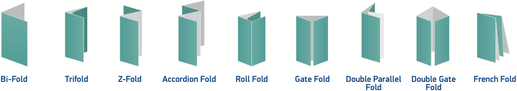
Folding Options
HALF FOLD BROCHURE A half-fold brochure, also called a bifold brochure, is made up of a single sheet of paper folded into two. This divides the brochure into two panels. The standard brochure size for the half-fold is 8.5” x 11”. This fold is best for simple product presentation, such as one or two product features.
TRIFOLD BROCHURE The trifold brochure divides a single sheet of paper into three. The right panel folds underneath the leſt panel. The standard brochure size for the trifold brochure is 8.5” x 11”. As the most common fold, the trifold is great for general purposes. It provides a perfect balance between design and content.
Z-FOLD BROCHURE The Z-fold brochure also divides a single sheet of paper into three. It got its name from its distinct Z-shape that folds each panel on top of one another. 8.5” x 11” is the standard brochure size for the Z-Fold. The Z-fold is also great for general product presentations.
GATE FOLD BROCHURE The gate fold divides the paper into three unequal panels, with the side panels measuring one half of the width of the central panel. As the name implies, the side panels fold like a gate. The standard brochure size for the gate fold is 8.5” x 11”. The gate fold works great with single product presentations or graphic-heavy designs. In double gate fold, you fold in half the gate fold brochure.
FRENCH FOLD BROCHURE The French fold, also known as the right angle fold, is a unique fold that divides the brochure into four panels. The paper is folded in half, and then folded in half again, perpendicular to the first fold. The standard brochure size for the French fold is 8.5” x 14”. Graphic-heavy designs, maps, and invitations to sales and events are great content choices for the French fold.
ACCORDION FOLD BROCHURE The accordion fold divides your brochure into four panels which fold on top of one another, like an accordion. 8.5” x 14” is the standard size for the accordion fold. Choose this fold if you want to detail a step-by-step tutorial for your customers.
DOUBLE PARALLEL FOLD BROCHURE The double parallel brochure folds your paper in half to form two panels, and then in half again, to form two parallel folds that go in the same direction. The standard brochure size for the double parallel fold is 8.5” x 14”. This fold works well as a reference material that customers could use for your products and services.
Bronze
Starting at$00
Silver
Starting at$00
Gold
Starting at$000
For the consumer on a budget, the Bronze Design Package offers clean, original designs at cost-friendly prices. Provide
us with 1-2 images or logos, as well as your basic, essential text. We will then create a unique design using your files
and information and send you a proof to review within 2-4 business days.
Design pricing starts at $00
Includes 1-2 images or logos and basic copy
Up to 2 revisions
Text and Design Instructions. Tell us what you need:
For the consumer on a budget, the Silver Design Package offers clean, original designs at cost-friendly prices. Provide
us with 1-2 images or logos, as well as your basic, essential text. We will then create a unique design using your files
and information and send you a proof to review within 2-4 business days.
Design pricing starts at $00
Includes 1-2 images or logos and basic copy
Up to 2 revisions
Text and Design Instructions. Tell us what you need:
For the consumer on a budget, the Gold Design Package offers clean, original designs at cost-friendly prices. Provide
us with 1-2 images or logos, as well as your basic, essential text. We will then create a unique design using your files
and information and send you a proof to review within 2-4 business days.
Design pricing starts at $00
Includes 1-2 images or logos and basic copy
Up to 2 revisions
Text and Design Instructions. Tell us what you need: